Tuesday, September 20, 2011
Logo Heist
Everyone remembers this company's name and logo. I decided to simply alter this logo because it's already so iconic. Originally created by legendary graphic designer Paul Rand, I thought it would be a good idea to take a recognizable corporate logo and alter it to reflect what the company is really about.
Enron was essentially a company formed by a merger of Texas-based oil and natural gas energy companies. They rose to prominence when they inserted themselves into other states' energy markets and then became a limited liability company (LLC) and then later successfully applied for government deregulation. Once they had these key components, they proceeded to fraudulently report their income and failed to disclose losses. This lead thousands of investors to believe that this was a profitable company. By operating out of California and by maintaining no government regulation, Enron was able to further manipulate the market by having employees at major California energy plants divert as much energy out of state as they wanted, and even shutting them down altogether (rolling blackouts) to create a false "energy crisis". They were then able to sell the state-regulated power/utility companies their own electricity back to them at a rate of up to 20 times it's original value, and netted themselves a profit of over 800% between April 2000 and December 2000. Since they didn't have to answer to government regulators, it was a long time before anyone was able to find out exactly what they were really doing. By the time anyone had discovered what was going on, they had bankrupted the California energy companies PG&E and Southern California Edison, they had laid off over 4,000 of their own employees, and when it became known that they had defrauded their investors as well as California state funds of nearly 50 billion dollars- it was too late to get the money back. The taxpayers, customers and investors had to pay the bill. Enron basically screwed everyone.
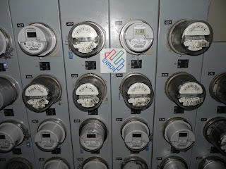
To this end, I decided to turn the logo from a colorful letter 'E' into a colorful hand making a gesture with an extended middle finger. With the knowledge of what this company has done, I think it's pretty self-explanatory.
I decided that the best place to post this image is a place that has a direct relationship to the ugly history of the company in question (and by extension, their logo). Pretty much everyone in California was affected by the energy crisis in the form of raised electricity bills, increased taxes to bail out the state utilities who were bankrupted by the need to buy back their own electricity at 20 times the price they originally sold it for, and in some cases by rolling blackouts. So I decided to post my logo in the middle of the electricity meters at my apartment building.
Subscribe to:
Post Comments (Atom)


No comments:
Post a Comment